GUIA DA CONSTRUÇÃO
GUIA DA CONSTRUÇÃO
Rebuilding a construction-industry CRM whose users had learned to work around it, with paper notes, a third-party image compressor, and capital letters standing in for a reply system.
Client
GUIA DA CONSTRUÇÃO
Year
2025
Category
End-to-end design
THE PROBLEM
THE PROBLEM
Guia da Construção already had a CRM. That was the problem.
The existing system had been built years earlier and never adapted to the way the business actually worked. It wasn't responsive, so field data collectors couldn't use it on a phone. They wrote site details on paper during the day and typed them into a desktop computer at night. Every site was recorded twice.
The rest of the workflow had the same shape — people had built habits around the software's limitations rather than the other way round:
— The capture form was one dense desktop page: forty-two checkboxes in a single flat alphabetical grid, five separate free-text fields for one address, and a raw browser file input for photos. — That file input rejected photos at normal camera resolution, so collectors compressed every image on a third-party website before they could submit it. — With no maps integration, every address was typed by hand. — At the bottom of the form sat one free-text box labelled "Observação". When a consultant needed a record corrected, they typed into it IN CAPITAL LETTERS. The collector replied underneath, in lower case. Capitalisation was the protocol — and clients could read the whole exchange. — The interface was dense enough that the company ran training workshops so that clients could learn to use it. — Several features had fallen out of date with how the business actually operated.
A product that needs a workshop is a product that hasn't been designed. That was the brief.
Guia da Construção already had a CRM. That was the problem.
The existing system had been built years earlier and never adapted to the way the business actually worked. It wasn't responsive, so field data collectors couldn't use it on a phone. They wrote site details on paper during the day and typed them into a desktop computer at night. Every site was recorded twice.
The rest of the workflow had the same shape — people had built habits around the software's limitations rather than the other way round:
— The capture form was one dense desktop page: forty-two checkboxes in a single flat alphabetical grid, five separate free-text fields for one address, and a raw browser file input for photos. — That file input rejected photos at normal camera resolution, so collectors compressed every image on a third-party website before they could submit it. — With no maps integration, every address was typed by hand. — At the bottom of the form sat one free-text box labelled "Observação". When a consultant needed a record corrected, they typed into it IN CAPITAL LETTERS. The collector replied underneath, in lower case. Capitalisation was the protocol — and clients could read the whole exchange. — The interface was dense enough that the company ran training workshops so that clients could learn to use it. — Several features had fallen out of date with how the business actually operated.
A product that needs a workshop is a product that hasn't been designed. That was the brief.

The legacy capture form. Every workaround in this case study started here — the compressor, the paper notes, and the capitalisation protocol in the box at the bottom.
THE PROBLEM
Guia da Construção already had a CRM. That was the problem.
The existing system had been built years earlier and never adapted to the way the business actually worked. It wasn't responsive, so field data collectors couldn't use it on a phone. They wrote site details on paper during the day and typed them into a desktop computer at night. Every site was recorded twice.
The rest of the workflow had the same shape — people had built habits around the software's limitations rather than the other way round:
— The capture form was one dense desktop page: forty-two checkboxes in a single flat alphabetical grid, five separate free-text fields for one address, and a raw browser file input for photos. — That file input rejected photos at normal camera resolution, so collectors compressed every image on a third-party website before they could submit it. — With no maps integration, every address was typed by hand. — At the bottom of the form sat one free-text box labelled "Observação". When a consultant needed a record corrected, they typed into it IN CAPITAL LETTERS. The collector replied underneath, in lower case. Capitalisation was the protocol — and clients could read the whole exchange. — The interface was dense enough that the company ran training workshops so that clients could learn to use it. — Several features had fallen out of date with how the business actually operated.
A product that needs a workshop is a product that hasn't been designed. That was the brief.
The legacy capture form. Every workaround in this case study started here — the compressor, the paper notes, and the capitalisation protocol in the box at the bottom.
THE CONSTRAINTS
THE CONSTRAINTS
Four constraints shaped every decision that follows.
One developer. A single engineer would build the entire product. Whatever I designed had to be implementable by one person, in sequence, without a component library to lean on.
Five roles, one data model. Clients, field data collectors, consultants and administrators do genuinely different jobs, but they all read and write the same underlying records. Every screen had to know who was looking at it.
MVP scope. The product had to be useful before it was complete. That meant deciding what could ship broken-but-manual and what could not ship at all.
No existing design system, and no budget to build one from scratch.
Four constraints shaped every decision that follows.
One developer. A single engineer would build the entire product. Whatever I designed had to be implementable by one person, in sequence, without a component library to lean on.
Five roles, one data model. Clients, field data collectors, consultants and administrators do genuinely different jobs, but they all read and write the same underlying records. Every screen had to know who was looking at it.
MVP scope. The product had to be useful before it was complete. That meant deciding what could ship broken-but-manual and what could not ship at all.
No existing design system, and no budget to build one from scratch.
THE CONSTRAINTS
Four constraints shaped every decision that follows.
One developer. A single engineer would build the entire product. Whatever I designed had to be implementable by one person, in sequence, without a component library to lean on.
Five roles, one data model. Clients, field data collectors, consultants and administrators do genuinely different jobs, but they all read and write the same underlying records. Every screen had to know who was looking at it.
MVP scope. The product had to be useful before it was complete. That meant deciding what could ship broken-but-manual and what could not ship at all.
No existing design system, and no budget to build one from scratch.
THE TWO SIDES OF THE PRODUCT
THE TWO SIDES OF THE PRODUCT
The product has two sides.
On the supply side, field collectors work outdoors, on a phone, often one-handed and with bad connectivity — their job is capture, recording a construction site while standing in front of it. Consultants are the gate: they verify what was submitted, calling the numbers on the record and confirming the site is still active, then either approve it or return it with comments for the collector to fix. Administrators manage users, access, and which cities each client account can see.
On the demand side, clients subscribe to a plan that sets how many cities they're entitled to, and can create their own users — sellers — inside their account. Sellers receive assigned sites and register sites of their own. Clients and their sellers share a Kanban board and reminder scheduling.
A single site record is filtered three times before anyone on the demand side sees it: by role, by the cities an administrator has released to that account, and by whether a consultant has approved it. Five roles across two sides, one data model, and no duplicated screen sets — visibility resolves at component level.
The product has two sides.
On the supply side, field collectors work outdoors, on a phone, often one-handed and with bad connectivity — their job is capture, recording a construction site while standing in front of it. Consultants are the gate: they verify what was submitted, calling the numbers on the record and confirming the site is still active, then either approve it or return it with comments for the collector to fix. Administrators manage users, access, and which cities each client account can see.
On the demand side, clients subscribe to a plan that sets how many cities they're entitled to, and can create their own users — sellers — inside their account. Sellers receive assigned sites and register sites of their own. Clients and their sellers share a Kanban board and reminder scheduling.
A single site record is filtered three times before anyone on the demand side sees it: by role, by the cities an administrator has released to that account, and by whether a consultant has approved it. Five roles across two sides, one data model, and no duplicated screen sets — visibility resolves at component level.

Five roles across two sides. Supply captures and verifies; demand subscribes and works the leads. Clients create their own users — sellers — inside their account.
Five roles across two sides. Supply captures and verifies; demand subscribes and works the leads. Clients create their own users — sellers — inside their account.
THE TWO SIDES OF THE PRODUCT
The product has two sides.
On the supply side, field collectors work outdoors, on a phone, often one-handed and with bad connectivity — their job is capture, recording a construction site while standing in front of it. Consultants are the gate: they verify what was submitted, calling the numbers on the record and confirming the site is still active, then either approve it or return it with comments for the collector to fix. Administrators manage users, access, and which cities each client account can see.
On the demand side, clients subscribe to a plan that sets how many cities they're entitled to, and can create their own users — sellers — inside their account. Sellers receive assigned sites and register sites of their own. Clients and their sellers share a Kanban board and reminder scheduling.
A single site record is filtered three times before anyone on the demand side sees it: by role, by the cities an administrator has released to that account, and by whether a consultant has approved it. Five roles across two sides, one data model, and no duplicated screen sets — visibility resolves at component level.
Five roles across two sides. Supply captures and verifies; demand subscribes and works the leads. Clients create their own users — sellers — inside their account.
INFORMATION ARCHITECTURE
INFORMATION ARCHITECTURE
I mapped the system before drawing a single screen: what objects exist (leads, sites, clients, interactions, reminders), how they relate, and which role can see or change each one.
The structure settled into 7 main areas — lead selection, sales pipeline, construction map, dashboards, notes and reminders, interaction history, and user permissions — with role-based visibility applied at the object level rather than the screen level.
I mapped the system before drawing a single screen: what objects exist (leads, sites, clients, interactions, reminders), how they relate, and which role can see or change each one.
The structure settled into 7 main areas — lead selection, sales pipeline, construction map, dashboards, notes and reminders, interaction history, and user permissions — with role-based visibility applied at the object level rather than the screen level.
INFORMATION ARCHITECTURE
I mapped the system before drawing a single screen: what objects exist (leads, sites, clients, interactions, reminders), how they relate, and which role can see or change each one.
The structure settled into 7 main areas — lead selection, sales pipeline, construction map, dashboards, notes and reminders, interaction history, and user permissions — with role-based visibility applied at the object level rather than the screen level.

Role-to-capability map. Five roles, thirteen capabilities, one shared data model — the basis for resolving permissions at component level rather than duplicating screens per role.
Role-to-capability map. Five roles, thirteen capabilities, one shared data model — the basis for resolving permissions at component level rather than duplicating screens per role.

Admin navigation structure, moodboard, and initial wirefreams, mapped before any screen was drawn.
Admin navigation structure, moodboard, and initial wirefreams, mapped before any screen was drawn.
FLOWS AND SCREEN TRANSITION DIAGRAMS
FLOWS AND SCREEN TRANSITION DIAGRAMS
I documented flows as screen transition diagrams before designing the interfaces: entry points, decision branches, system events, and where each path ends.
Authentication and registration is the flow I documented most completely, because in this product signing up isn't a form — it's a sequence with approval and payment in the middle of it. The diagram covers three entry conditions, the full password recovery path, and the system-side events that users never see but that the flow depends on: the welcome email, the confirmation link, the payment link released on approval.
I documented flows as screen transition diagrams before designing the interfaces: entry points, decision branches, system events, and where each path ends.
Authentication and registration is the flow I documented most completely, because in this product signing up isn't a form — it's a sequence with approval and payment in the middle of it. The diagram covers three entry conditions, the full password recovery path, and the system-side events that users never see but that the flow depends on: the welcome email, the confirmation link, the payment link released on approval.
FLOWS AND SCREEN TRANSITION DIAGRAMS
I documented flows as screen transition diagrams before designing the interfaces: entry points, decision branches, system events, and where each path ends.
Authentication and registration is the flow I documented most completely, because in this product signing up isn't a form — it's a sequence with approval and payment in the middle of it. The diagram covers three entry conditions, the full password recovery path, and the system-side events that users never see but that the flow depends on: the welcome email, the confirmation link, the payment link released on approval.


The same flow while it was being worked out. Hand-drawn, on the board, before anything was specified.
The same flow while it was being worked out. Hand-drawn, on the board, before anything was specified.
THE DECISION THAT MATTERED
THE DECISION THAT MATTERED
The problem. In the old system there was one notes field, shared by everyone. A consultant returning a site for correction wrote in capital letters; the collector answered underneath in lower case. Capitalisation was the protocol. And clients — the people paying for the data — could read the entire argument about whether that data was wrong.
Option 1 — keep one thread, control visibility per message. Whoever writes decides who can see it. Flexible, cheap to build, and it fixes the immediate leak.
Option 2 — two separate spaces, defined by audience. Verification stays between consultant and collector and never reaches the demand side. Clients and their sellers get a space of their own.
After working through it with the client, we took the second. Visibility became a consequence of where you were writing rather than a checkbox someone had to remember — and on a step of an approval workflow, the safe outcome shouldn't depend on memory.
What it cost. Transparency. Clients can't see the verification history: they don't know why a site took three days to arrive, or what was corrected before it did. The old system leaked that information by accident; the new one withholds it by design. For a product people pay for on the promise of data quality, that's a real trade, and I'd revisit it if clients ever start asking why a site was delayed.
The problem. In the old system there was one notes field, shared by everyone. A consultant returning a site for correction wrote in capital letters; the collector answered underneath in lower case. Capitalisation was the protocol. And clients — the people paying for the data — could read the entire argument about whether that data was wrong.
Option 1 — keep one thread, control visibility per message. Whoever writes decides who can see it. Flexible, cheap to build, and it fixes the immediate leak.
Option 2 — two separate spaces, defined by audience. Verification stays between consultant and collector and never reaches the demand side. Clients and their sellers get a space of their own.
After working through it with the client, we took the second. Visibility became a consequence of where you were writing rather than a checkbox someone had to remember — and on a step of an approval workflow, the safe outcome shouldn't depend on memory.
What it cost. Transparency. Clients can't see the verification history: they don't know why a site took three days to arrive, or what was corrected before it did. The old system leaked that information by accident; the new one withholds it by design. For a product people pay for on the promise of data quality, that's a real trade, and I'd revisit it if clients ever start asking why a site was delayed.

The internal thread. Name, role and timestamp are part of every message — the information capitalisation used to carry. Field observations and correction requests share the space, and none of it reaches the demand side.
The internal thread. Name, role and timestamp are part of every message — the information capitalisation used to carry. Field observations and correction requests share the space, and none of it reaches the demand side.
THE DECISION THAT MATTERED
The problem. In the old system there was one notes field, shared by everyone. A consultant returning a site for correction wrote in capital letters; the collector answered underneath in lower case. Capitalisation was the protocol. And clients — the people paying for the data — could read the entire argument about whether that data was wrong.
Option 1 — keep one thread, control visibility per message. Whoever writes decides who can see it. Flexible, cheap to build, and it fixes the immediate leak.
Option 2 — two separate spaces, defined by audience. Verification stays between consultant and collector and never reaches the demand side. Clients and their sellers get a space of their own.
After working through it with the client, we took the second. Visibility became a consequence of where you were writing rather than a checkbox someone had to remember — and on a step of an approval workflow, the safe outcome shouldn't depend on memory.
What it cost. Transparency. Clients can't see the verification history: they don't know why a site took three days to arrive, or what was corrected before it did. The old system leaked that information by accident; the new one withholds it by design. For a product people pay for on the promise of data quality, that's a real trade, and I'd revisit it if clients ever start asking why a site was delayed.
The internal thread. Name, role and timestamp are part of every message — the information capitalisation used to carry. Field observations and correction requests share the space, and none of it reaches the demand side.
THE COMPONENT LIBRARY
THE COMPONENT LIBRARY
I built the interface on a Tailwind-based component foundation rather than designing components from scratch — a deliberate choice, because the developer would implement in Tailwind. Handoff became translation instead of interpretation.
I built the interface on a Tailwind-based component foundation rather than designing components from scratch — a deliberate choice, because the developer would implement in Tailwind. Handoff became translation instead of interpretation.


THE COMPONENT LIBRARY
I built the interface on a Tailwind-based component foundation rather than designing components from scratch — a deliberate choice, because the developer would implement in Tailwind. Handoff became translation instead of interpretation.
HANDOFF AND IMPLEMENTATION
HANDOFF AND IMPLEMENTATION
Design ended where most handoffs do, and then continued.
I wrote functional requirements, user stories and interaction specifications, and kept each screen traceable back to the rule that produced it — so a question during development could be answered by pointing at a document instead of a meeting.
Through implementation I stayed on as technical lead: reviewing each build against the specification, mentoring the developer on structure, and resolving the cases the documentation hadn't anticipated.
Design ended where most handoffs do, and then continued.
I wrote functional requirements, user stories and interaction specifications, and kept each screen traceable back to the rule that produced it — so a question during development could be answered by pointing at a document instead of a meeting.
Through implementation I stayed on as technical lead: reviewing each build against the specification, mentoring the developer on structure, and resolving the cases the documentation hadn't anticipated.
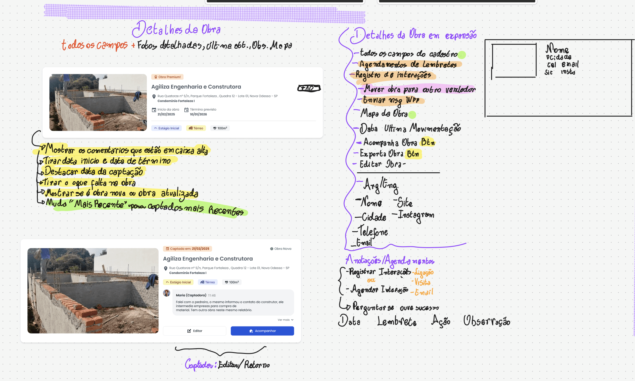
Review notes on a delivered screen. Every change agreed with the client was written onto the artefact it affected.
Review notes on a delivered screen. Every change agreed with the client was written onto the artefact it affected.
HANDOFF AND IMPLEMENTATION
Design ended where most handoffs do, and then continued.
I wrote functional requirements, user stories and interaction specifications, and kept each screen traceable back to the rule that produced it — so a question during development could be answered by pointing at a document instead of a meeting.
Through implementation I stayed on as technical lead: reviewing each build against the specification, mentoring the developer on structure, and resolving the cases the documentation hadn't anticipated.
Review notes on a delivered screen. Every change agreed with the client was written onto the artefact it affected.
OUTCOME
OUTCOME
The redesigned system is currently in testing with real users. Three things that phase has shown so far.
Clients are using it without training. The old system required the company to run workshops so that clients could learn it. In testing, no workshop has been needed.
Site records moved to the phone. Collectors are registering sites on a mobile device, in the field. The paper notes and the evening re-entry are gone.
Scope delivered: four user roles served by a single shared screen set · around 30 core screens designed in Figma · roughly 50 total interfaces including component states, authentication flows, role-specific views and modals · one developer, implementing from the documentation.
Testing is still running, and the numbers I most want — time to record a site, leads worked per consultant — aren't in yet.
The redesigned system is currently in testing with real users. Three things that phase has shown so far.
Clients are using it without training. The old system required the company to run workshops so that clients could learn it. In testing, no workshop has been needed.
Site records moved to the phone. Collectors are registering sites on a mobile device, in the field. The paper notes and the evening re-entry are gone.
Scope delivered: four user roles served by a single shared screen set · around 30 core screens designed in Figma · roughly 50 total interfaces including component states, authentication flows, role-specific views and modals · one developer, implementing from the documentation.
Testing is still running, and the numbers I most want — time to record a site, leads worked per consultant — aren't in yet.


OUTCOME
The redesigned system is currently in testing with real users. Three things that phase has shown so far.
Clients are using it without training. The old system required the company to run workshops so that clients could learn it. In testing, no workshop has been needed.
Site records moved to the phone. Collectors are registering sites on a mobile device, in the field. The paper notes and the evening re-entry are gone.
Scope delivered: four user roles served by a single shared screen set · around 30 core screens designed in Figma · roughly 50 total interfaces including component states, authentication flows, role-specific views and modals · one developer, implementing from the documentation.
Testing is still running, and the numbers I most want — time to record a site, leads worked per consultant — aren't in yet.
WHAT I'D DO DIFFERENTLY
WHAT I'D DO DIFFERENTLY
The delivery window was tight, so I made a call: design the board properly, skip writing the state model down. The stages were decided at the right point in the process. They just never left my head.
Nothing broke. The developer built it, it works, and the stages have held. What I traded away was everything documentation does that isn't communication — the model couldn't be reviewed, couldn't be argued with, and left no record of why the stages sit in the order they do.
The board below is the artefact. There is no document behind it. A year on, the reasoning still lives in exactly one place, and that's a fragile way to leave a decision that shapes how an entire sales team sees its own work.
I write the state model down now, even when the schedule says there's no time. It's the cheapest artefact in a project and the first one to get cut.
The delivery window was tight, so I made a call: design the board properly, skip writing the state model down. The stages were decided at the right point in the process. They just never left my head.
Nothing broke. The developer built it, it works, and the stages have held. What I traded away was everything documentation does that isn't communication — the model couldn't be reviewed, couldn't be argued with, and left no record of why the stages sit in the order they do.
The board below is the artefact. There is no document behind it. A year on, the reasoning still lives in exactly one place, and that's a fragile way to leave a decision that shapes how an entire sales team sees its own work.
I write the state model down now, even when the schedule says there's no time. It's the cheapest artefact in a project and the first one to get cut.

WHAT I'D DO DIFFERENTLY
The delivery window was tight, so I made a call: design the board properly, skip writing the state model down. The stages were decided at the right point in the process. They just never left my head.
Nothing broke. The developer built it, it works, and the stages have held. What I traded away was everything documentation does that isn't communication — the model couldn't be reviewed, couldn't be argued with, and left no record of why the stages sit in the order they do.
The board below is the artefact. There is no document behind it. A year on, the reasoning still lives in exactly one place, and that's a fragile way to leave a decision that shapes how an entire sales team sees its own work.
I write the state model down now, even when the schedule says there's no time. It's the cheapest artefact in a project and the first one to get cut.
More Works More Works
More Works More Works